Signature Collection Packaging
The aim of the Signature Collection packaging redesign was to evolve it enough to suit the brand’s positioning and aspirations without going so far as to lose its existing customer.
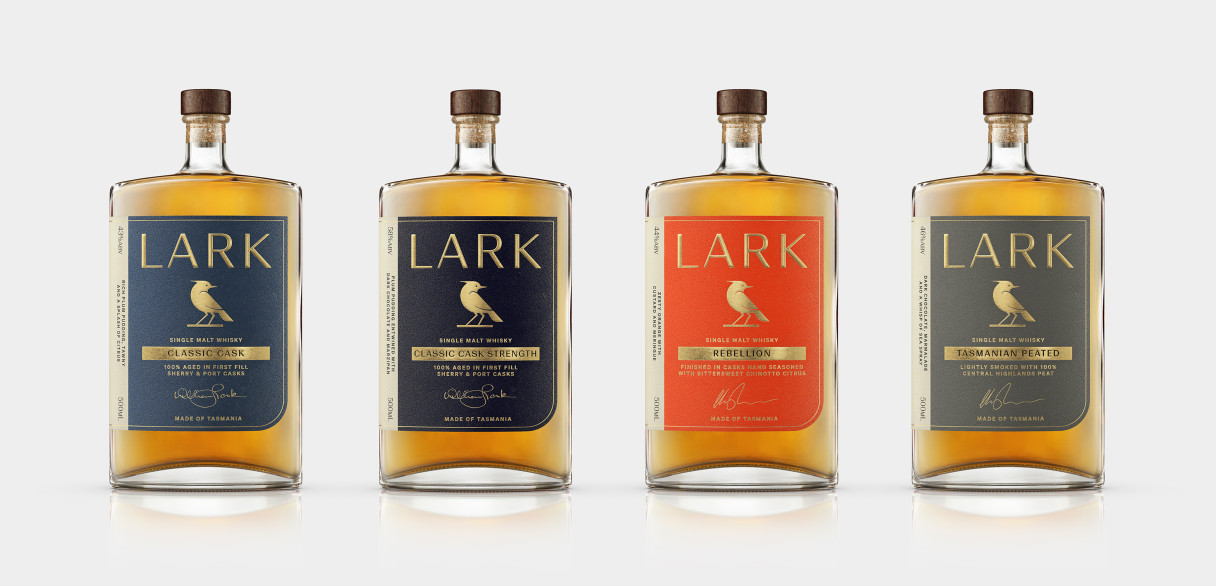
In evolving the Lark Signature Collection, keeping certain elements of the preceding packaging was vital. Namely, the label shape (with its rounded lower right corner), large wraparound format and navy and cyan colour palette. We also retained the brand’s positioning at the top of the label, the gold bar containing the product name and the unique bottle shape.
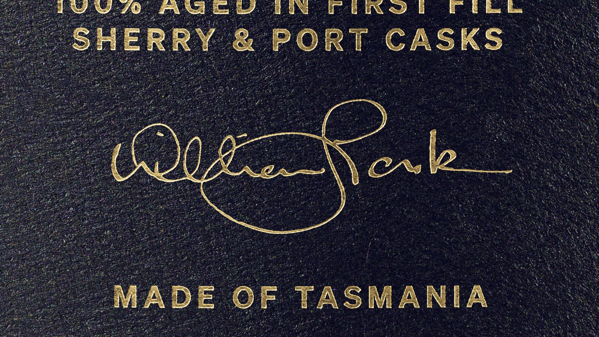
From there, we approached the new packaging with the retained assets in a far more contemporary and minimalistic way. We adopted bold colours across the range to provide greater shelf (and darkened bar) presence. Gold foil and embossing were also used to provide contrast atop the textured uncoated label stock and further amplify premium luxury cues.
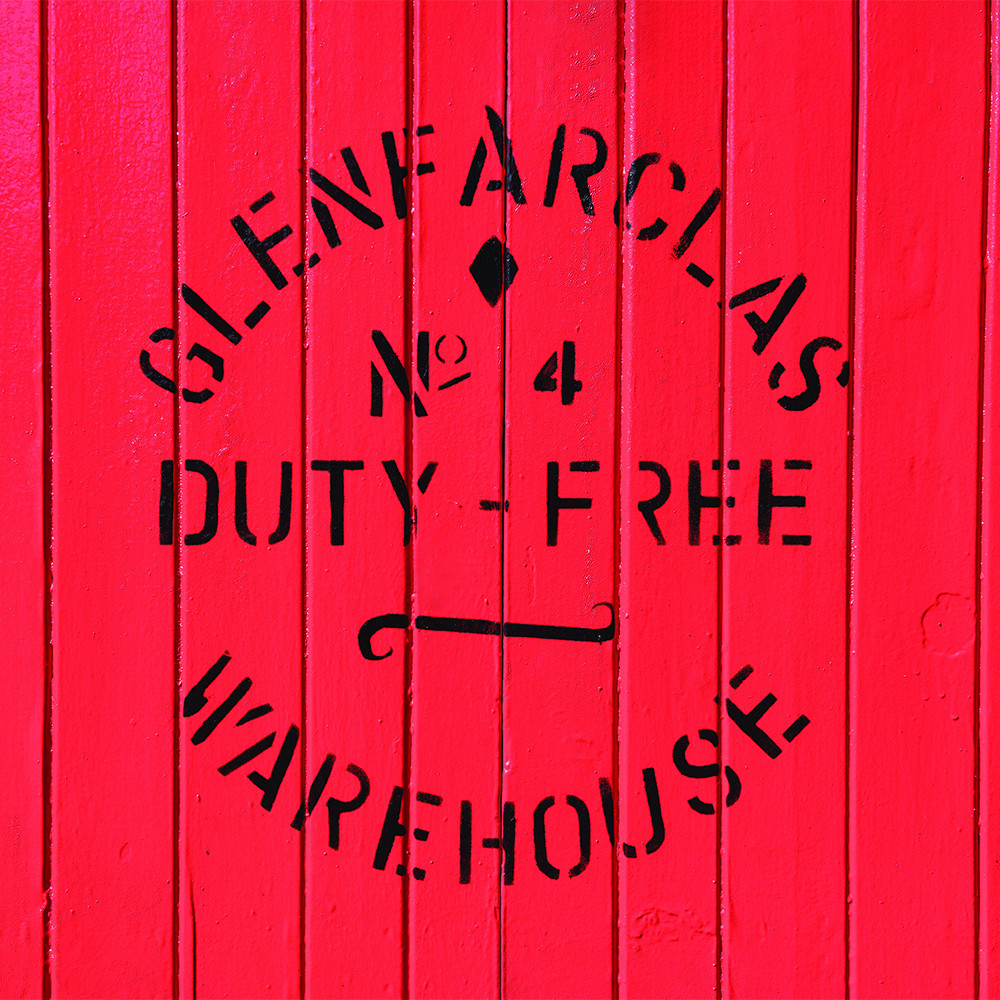
With more whiskies planned for the range, ensuring the brand architecture and naming protocols were in place and could adequately support future expansion was vital. We named the first two whiskies within the range—Tasmania Peated (a lightly peated single malt using peat from Lark’s very own bog in Tasmania’s Central Highlands) and Rebellion (a chinotto-infused single malt).
Additionally, we introduced product statements, tasting notes and the signatures of founder Bill Lark and head distiller Chris Thomson to further enhance consumer confidence and instil brand credibility.
Ultimately, evolving the range so as to attract a new audience of whisky drinkers whilst not ostracising those already enjoying the range.


Credits
—
Renders: Visual State
Photography: King and Sobey
→ Lark Strategy
→ Lark Identity
→ Rare Cask Packaging
→ Legacy Packaging