Poltergeist Packaging
Whilst the name puns on spirits, Poltergeist never leveraged this idea to create a deeper or more intriguing story. So, we leaned into the paranormal by referencing Ouija and blurred objects and figures glimpsed in the periphery, often reported in ghostly encounters.
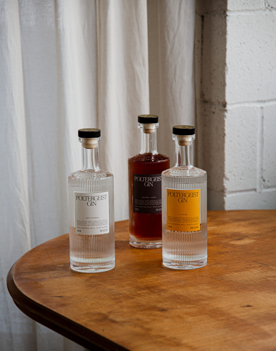
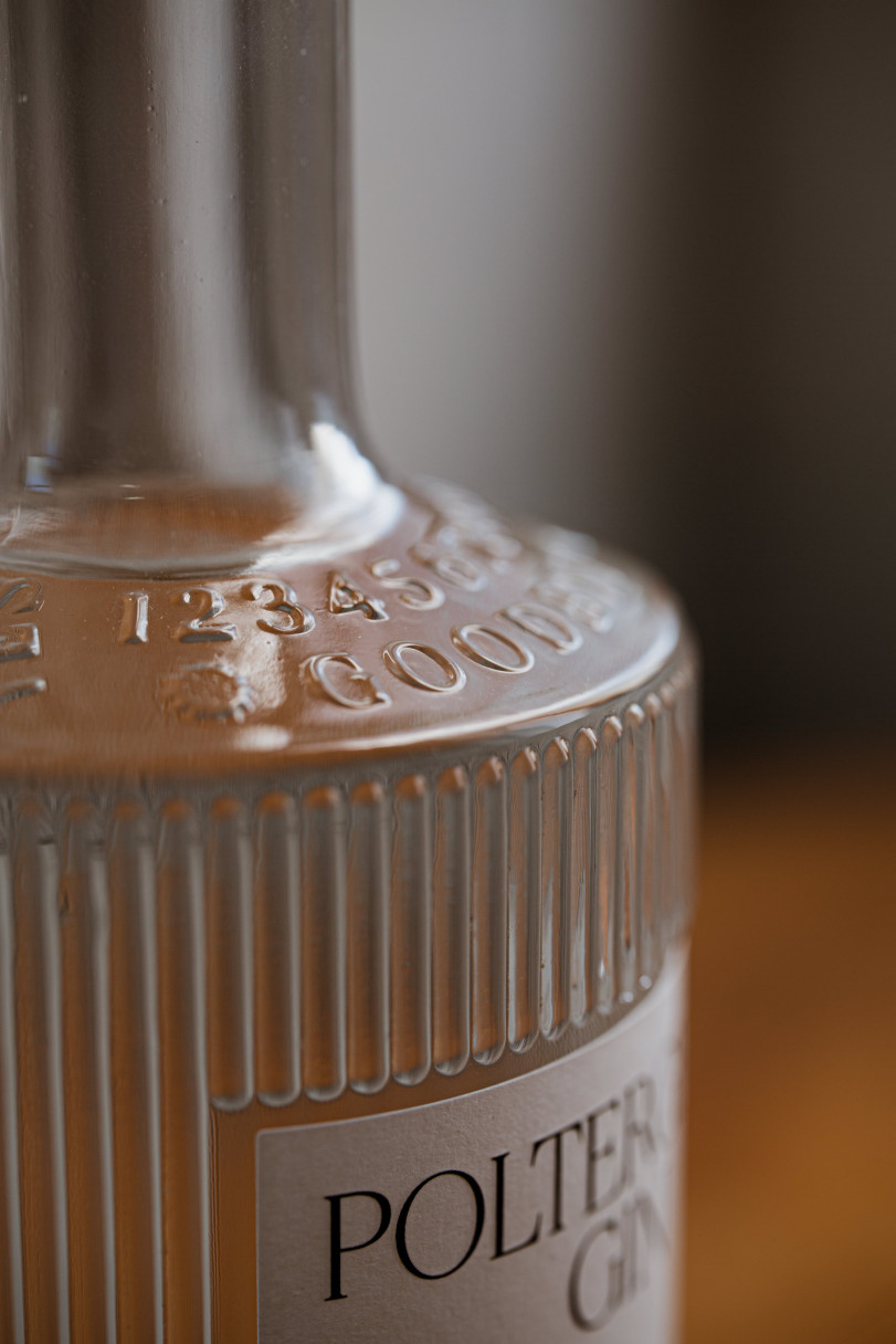
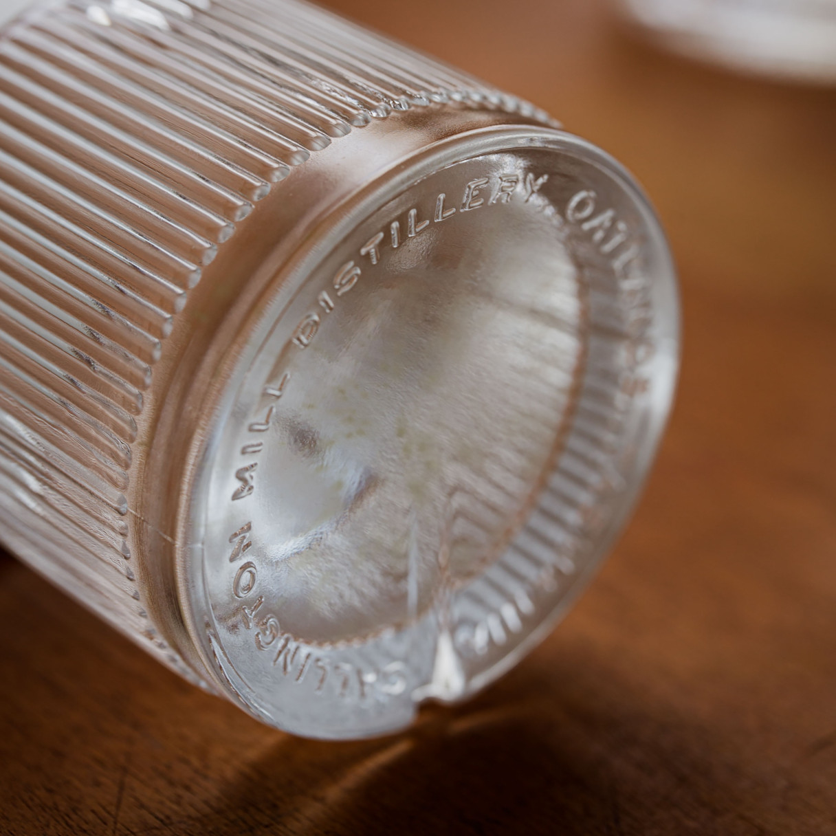
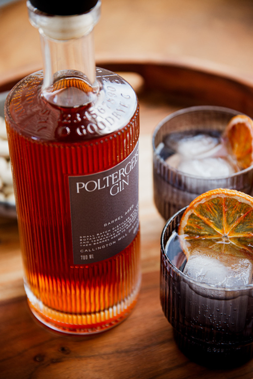
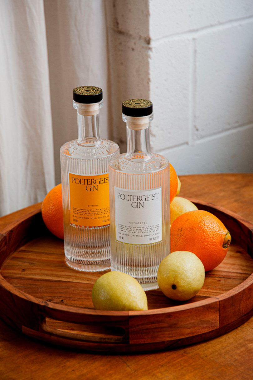
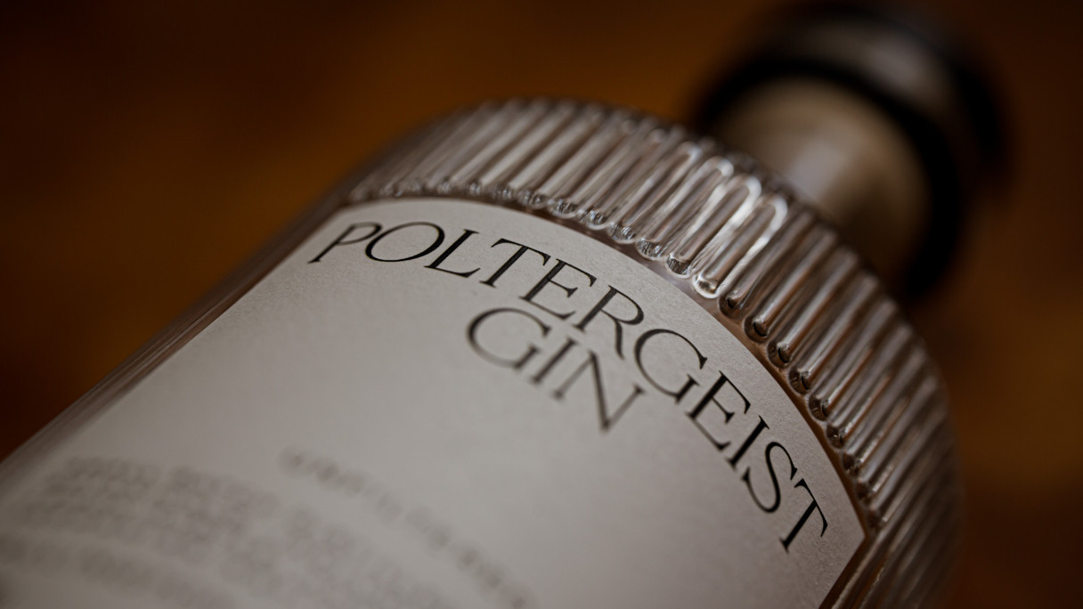
A new square-shouldered proprietary bottle was designed to make Poltergeist stand tall on shelf and step it away from the many rounded bottles used by the competition.
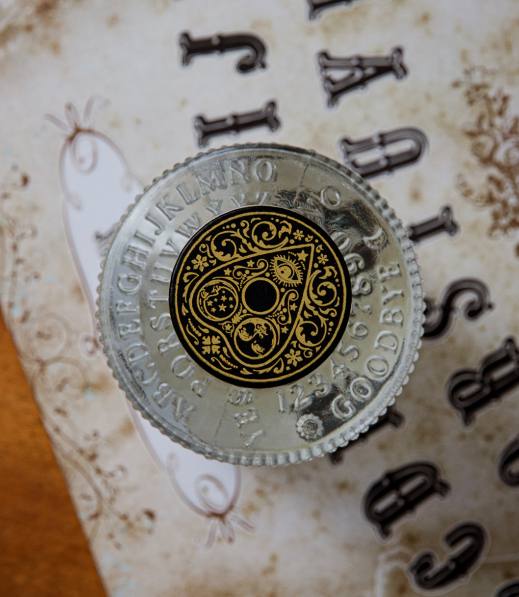
Fluted glass was employed for its ability to obscure objects on the periphery, whilst a Ouija board was embossed onto the shoulder, and the wooden stopper was used to resemble a planchette.
As for the labelling, superfluous decoration was out. A minimalist typographic style was established with bold colours used to differentiate the three offerings—Unfiltered, Citrus and Barrel Aged.
Poltergeist Gin is reincarnated and ready for its next life.