Joto Packaging
Joto is a range of artisanal Japanese sakes developed expressly for the North American market. To the Western eye, traditional sake packaging is all but indecipherable. It is almost impossible to build brand recognition and recall with an English-speaking audience.
Our strategy centred around forgoing sake packaging convention and developing a system that would speak directly to the target audience. And doing so in a way they were accustomed to.
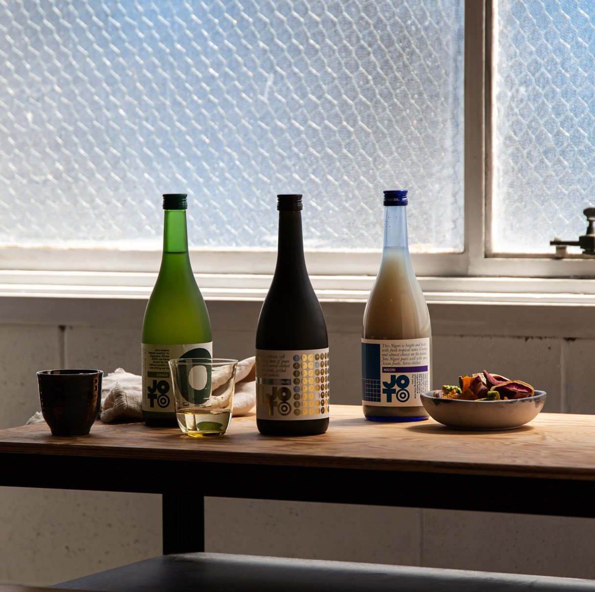
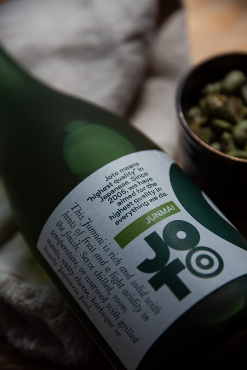
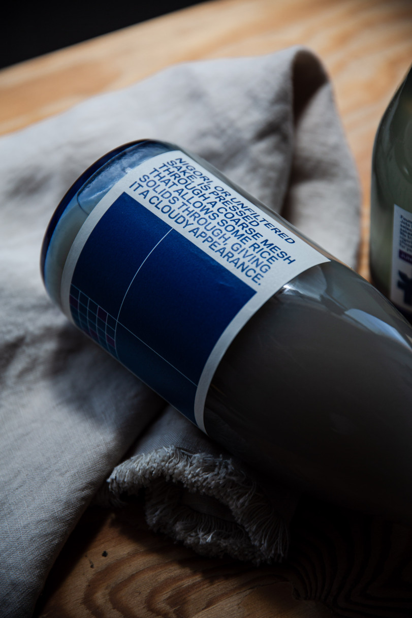
Joto’s packaging opts for bold colours and infographics describing each sake’s brewing process, ideal drinking temperature and what food to eat with it.
The labels are also easily recallable—the customer simply has to remember they had the gold sake rather than remembering it was a Daiginjo.
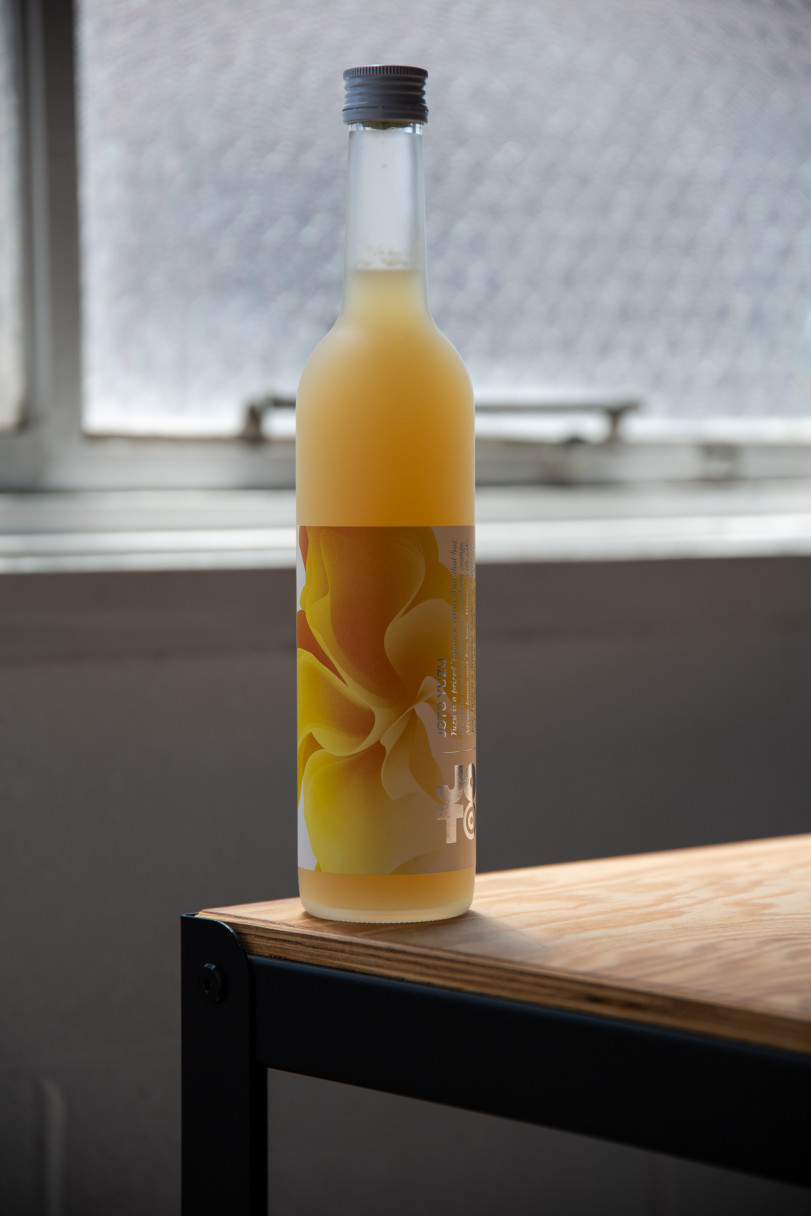
Following the success of the core Joto range, we developed packaging for a Yuzu-flavoured sake—perfect for spritzers and cocktails.