Joto Strategy
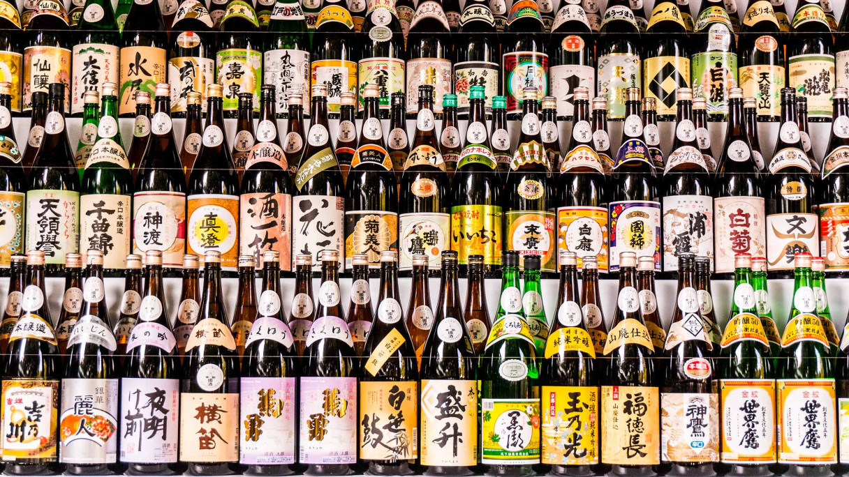
Joto is a range of artisanal Japanese sakes developed expressly for the North American market. To the Western eye, traditional sake packaging all looks the same—calligraphic brush stroke flourishes; black, red and gold graphics; faux woodcut stamps. Add to this that the names and information are all set in Japanese, and it’s almost impossible to build brand recognition and recall with an English-speaking audience.
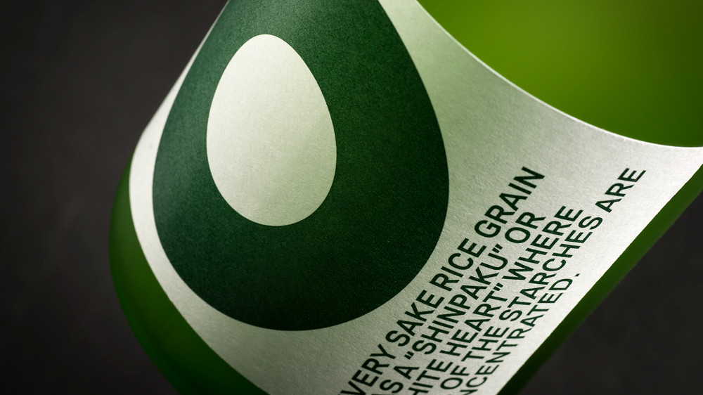
Our strategy centred around ignoring sake packaging convention and developing a system that spoke directly to the target audience.
An approach that leant on familiar branding cues, such as strong colour, bold graphics and clear information. The outcome was a highly memorable brand that was easy to spot over a crowded bar.
Similar Projects

A new wardrobe fit for a global leader.
Evolving a much-loved classic for today’s and tomorrow’s whisky drinker.

Australia’s most awarded gin steps out of the shadows, ready for the next life.
Using packaging to tell stories and engage the customer.