Croser Packaging
When Brian Croser first thought to create a sparkling wine, it was because he had found a region that could produce a wine to rival Champagne. That region was Piccadilly in the Adelaide Hills. The vines were hand pruned, the grapes hand picked, the fruit whole bunch pressed and the wines made in the traditional method. From its first release in 1985, Croser found its place as Australia’s finest sparkling—a wine to rival Champagne.
With the growth of the sparkling sector and the influx of affordable Champagne, Croser no longer had this space to itself. It needed to reassert its position.
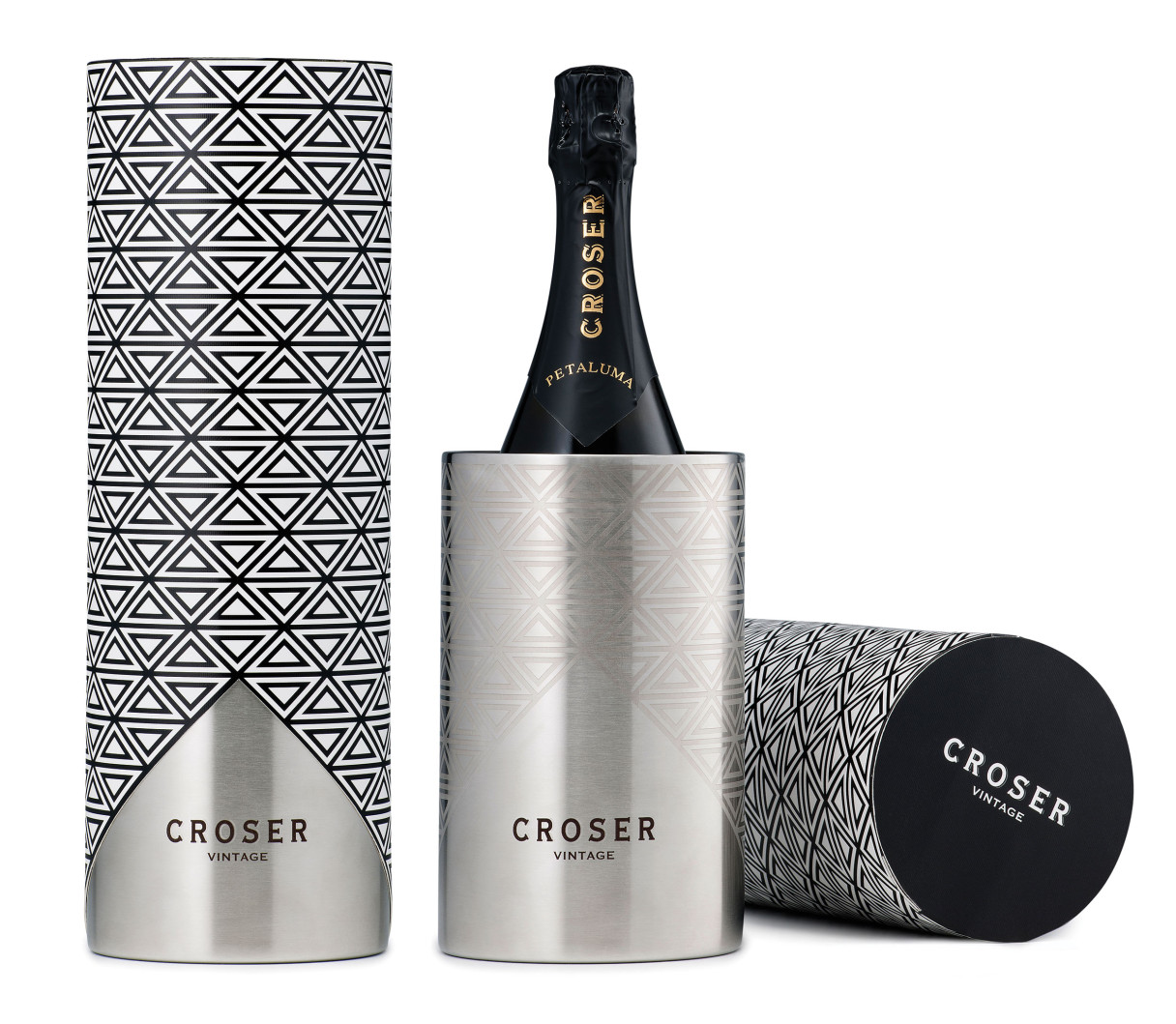
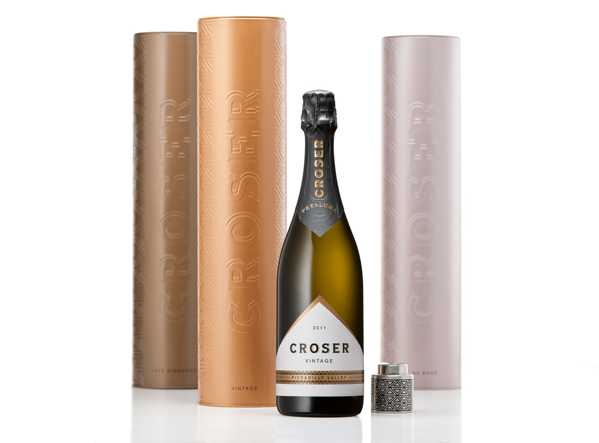
As part of an holistic brand review, we were asked to define the brand architecture, refresh the packaging and develop gifting opportunities.
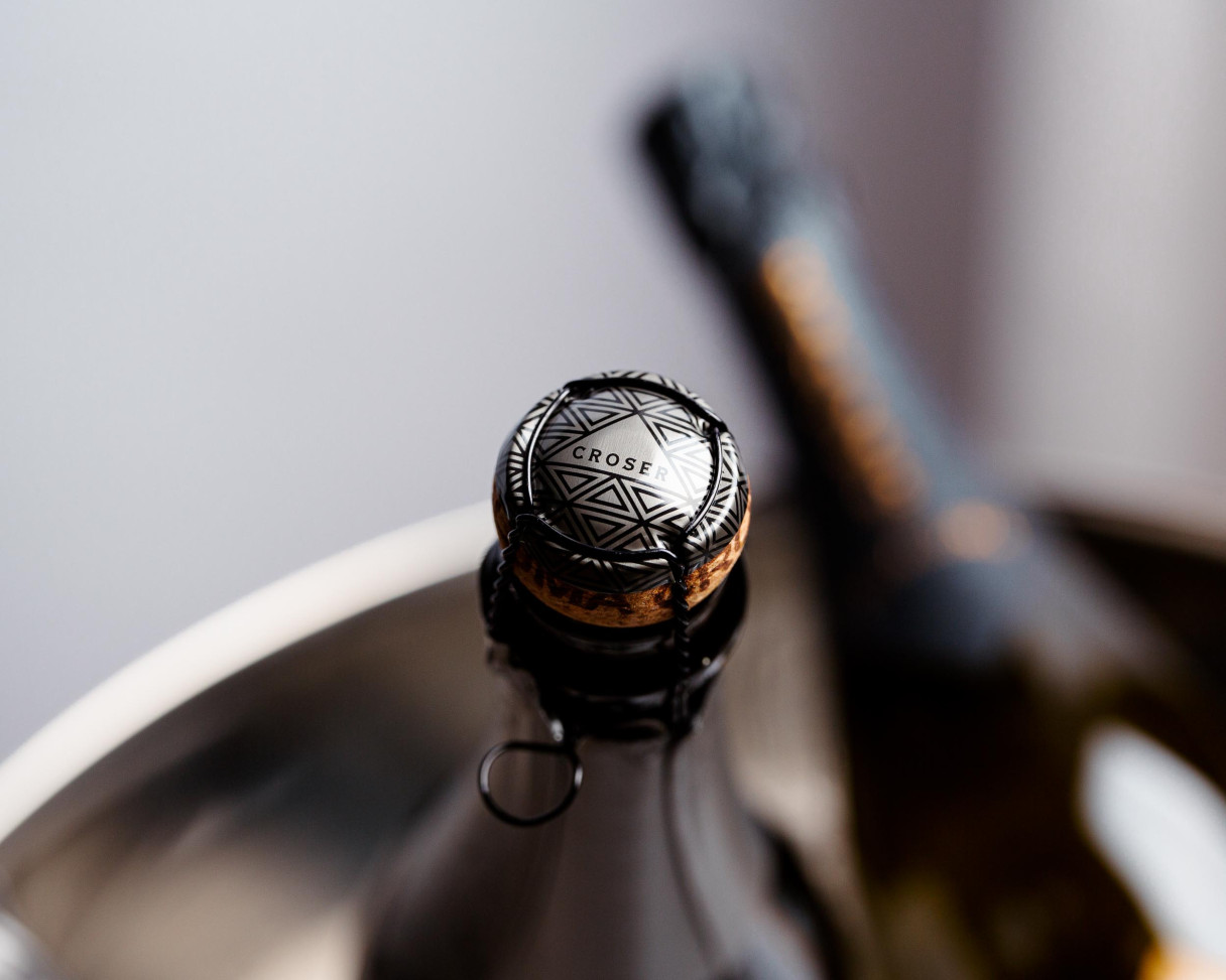
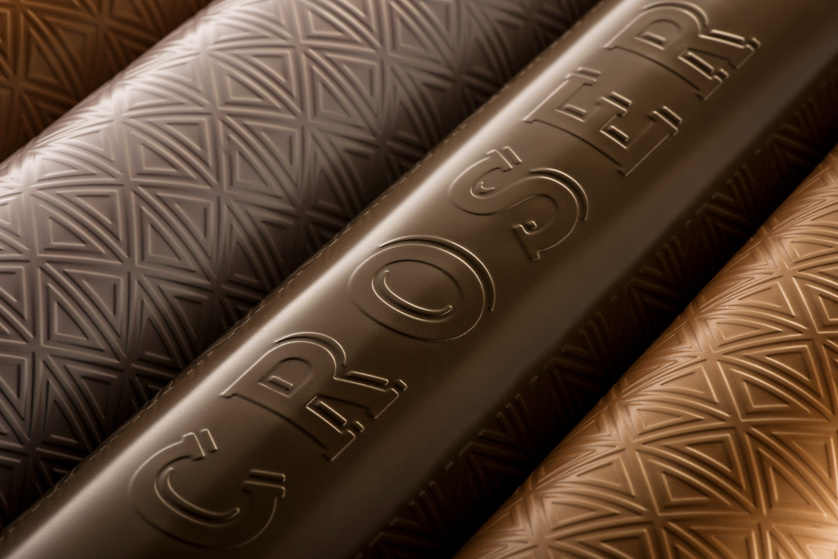
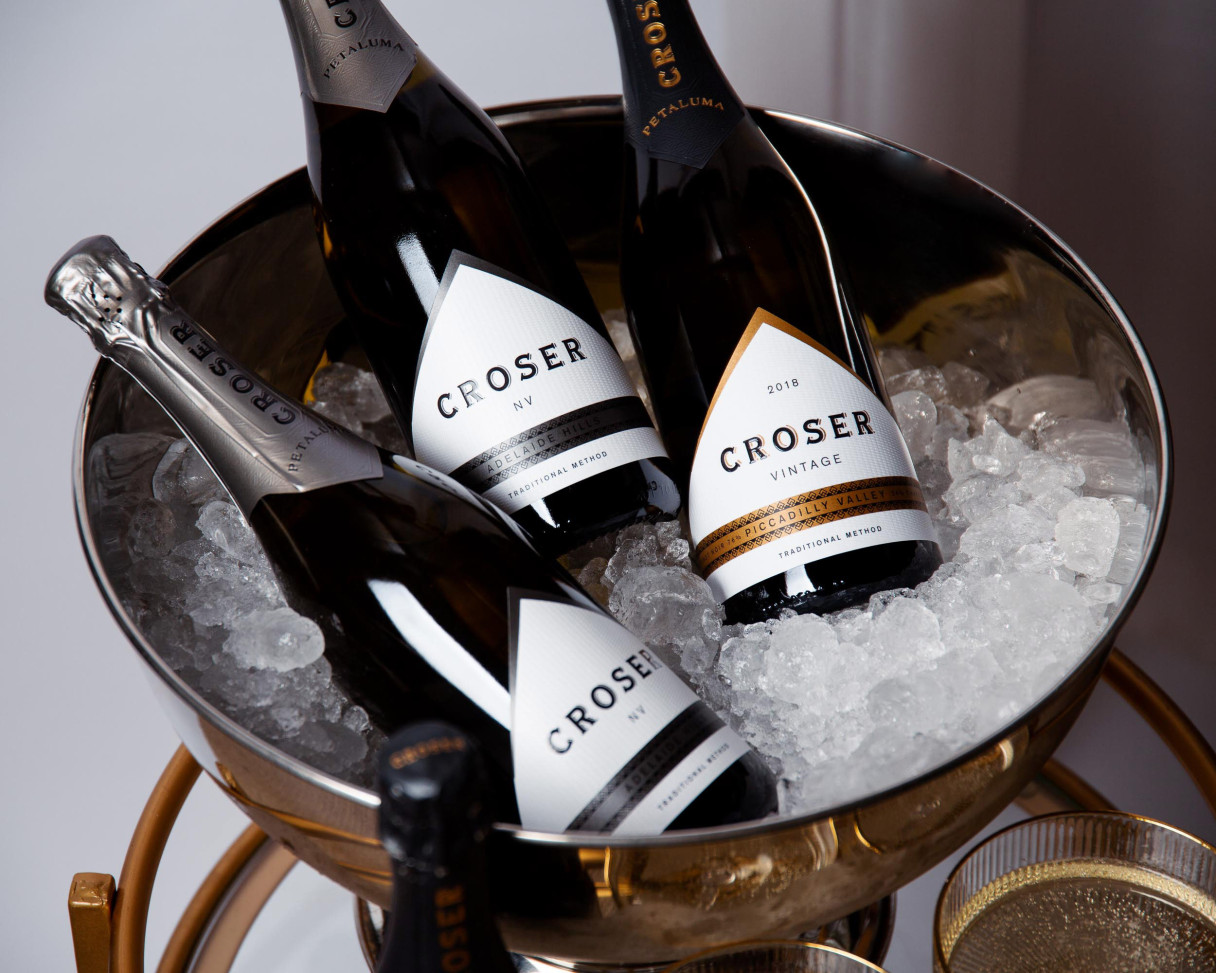
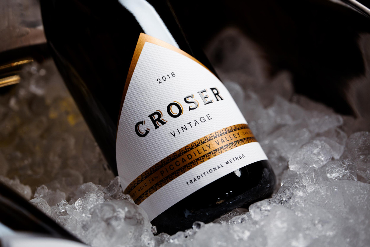
Our first step in the project was to audit the brand’s assets. The distinctive triangular label (a nod to folded linen napkins) was retained.
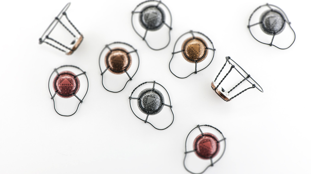
The Croser logotype was completely redrawn, resulting in a far more elegant and refined wordmark. A custom pattern was developed for hoods, and a custom grain for the labels.
The simplified labels incorporated new embellishments in the form of embossing, foiling and screening.
Croser is reborn!