Clare Valley Identity
No other region offers such a diverse mix of luxury, wine, food, history, culture, relaxation, action and adventure quite like Clare Valley. But its distance from Adelaide had traditionally been an obstacle to visitation and tourism. Clare Valley is just a little too far for a day trip. We saw this negative as a positive—the distance means you will need to stay a while. You will need to slow down. You will need to relax, unwind, soak it up and breathe it in.
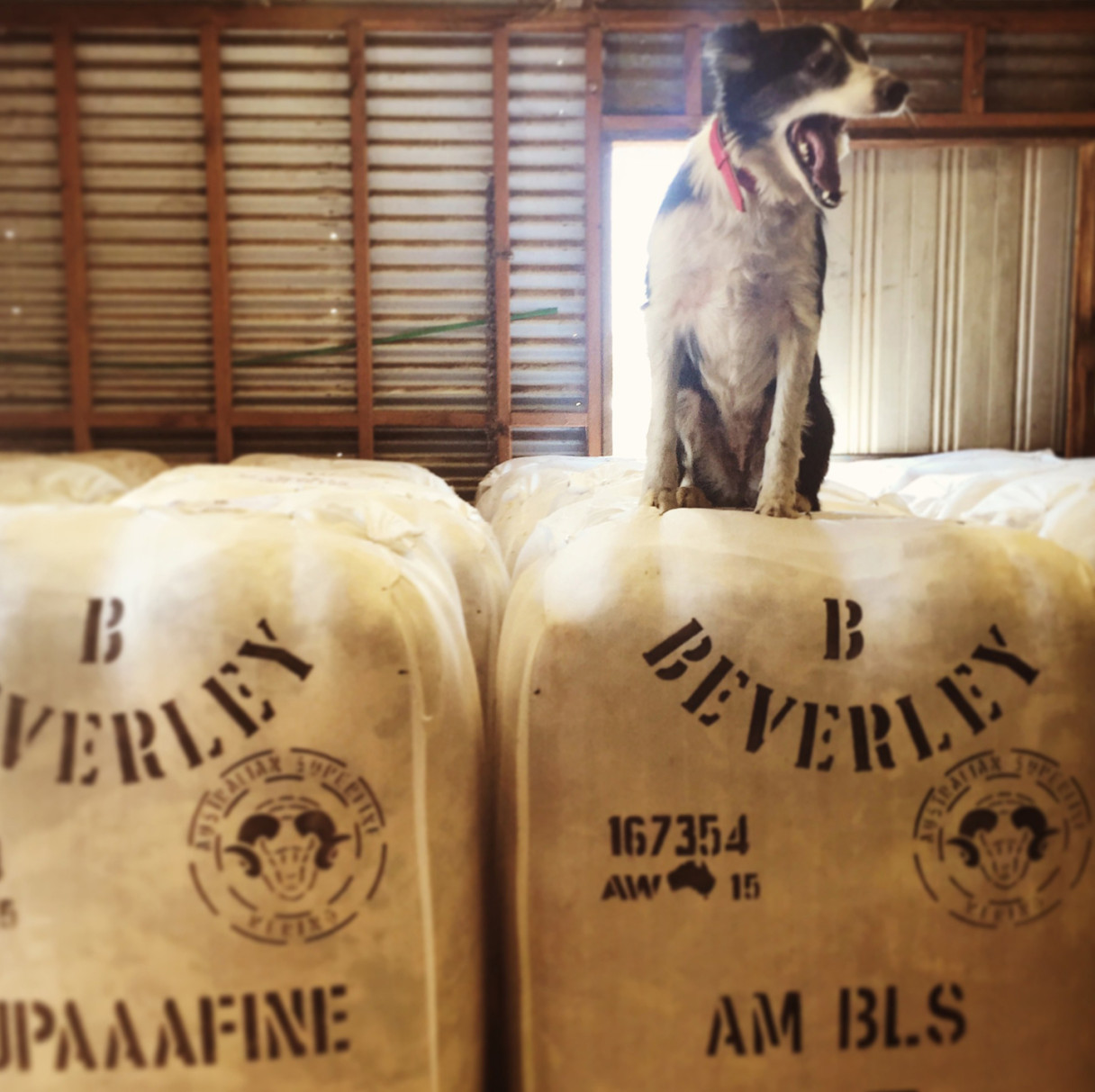
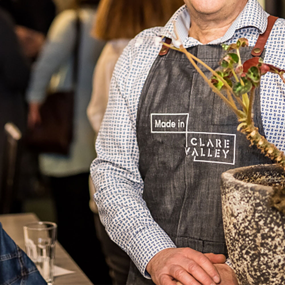
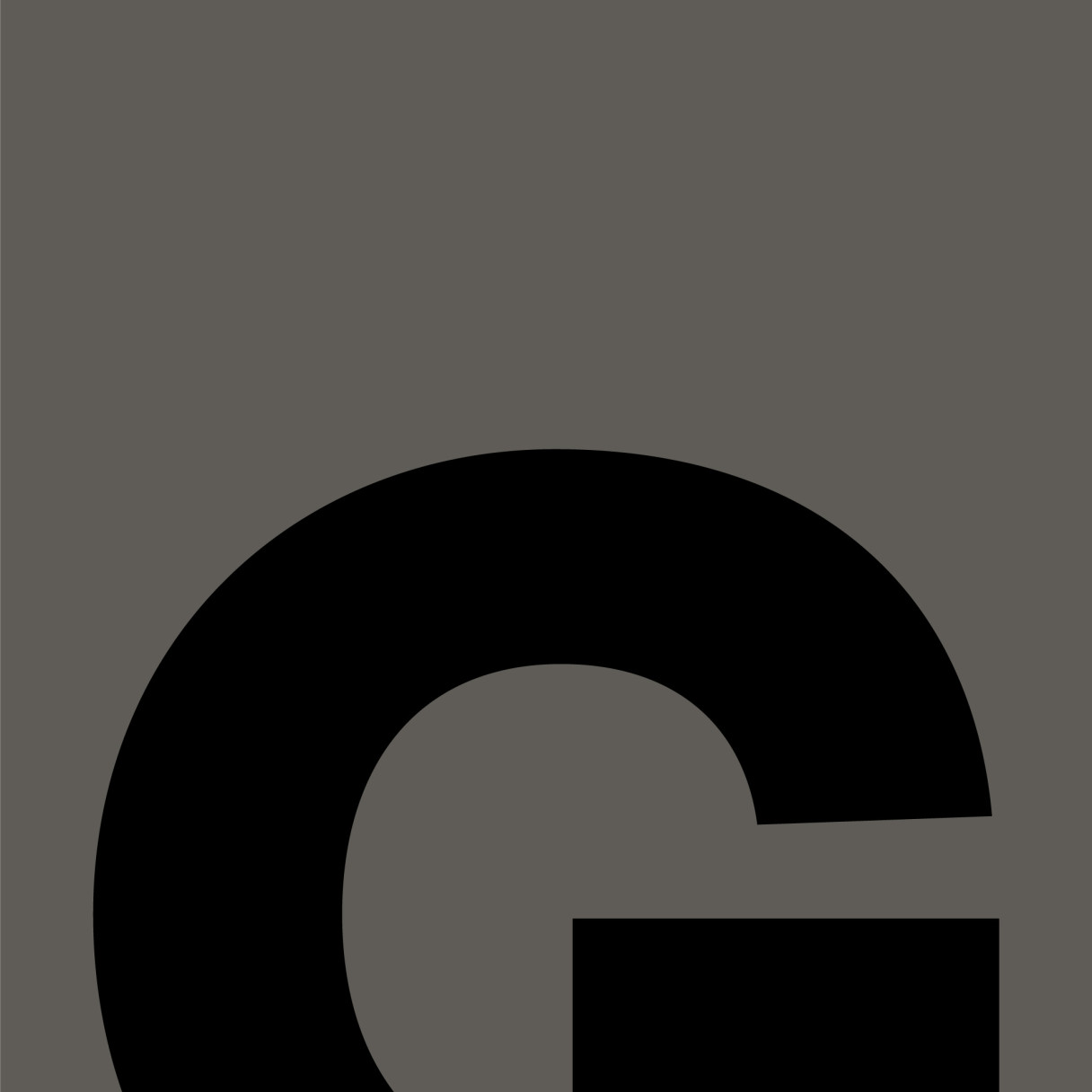
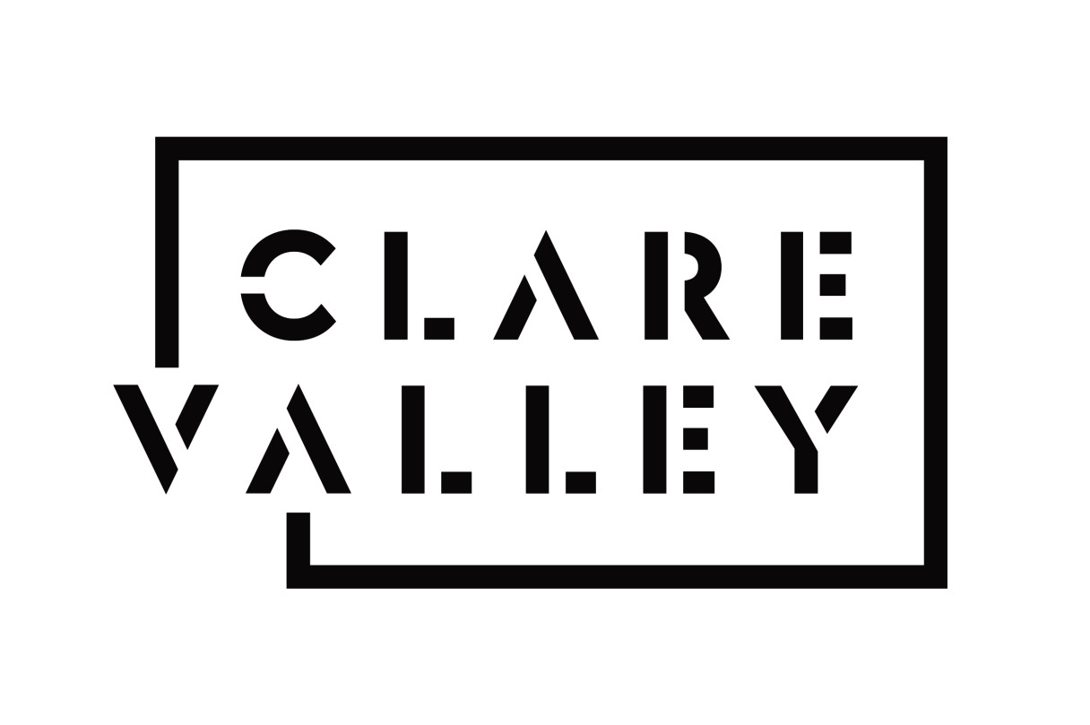
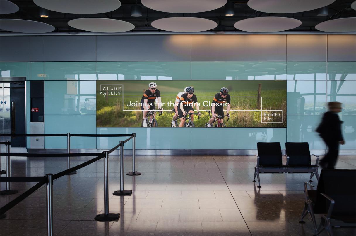
The Logo is the central plank to the new Clare Valley brand identity. Stencil typography speaks to the rich agricultural history of the region—from markings on hay bales, to wine barrels, to livestock branding and signage.
The letters V and A combine to form arrows, indicating routes and avenues of exploration in and around the region. It is a mark that is immediately identifiable and speaks to the what is unique about the region.
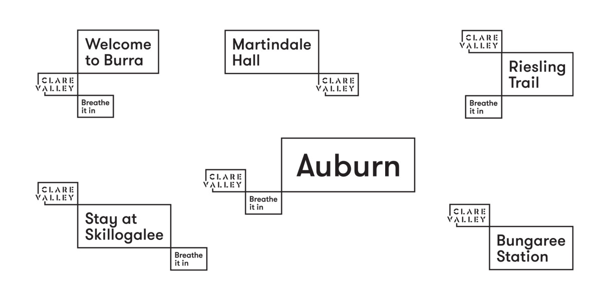
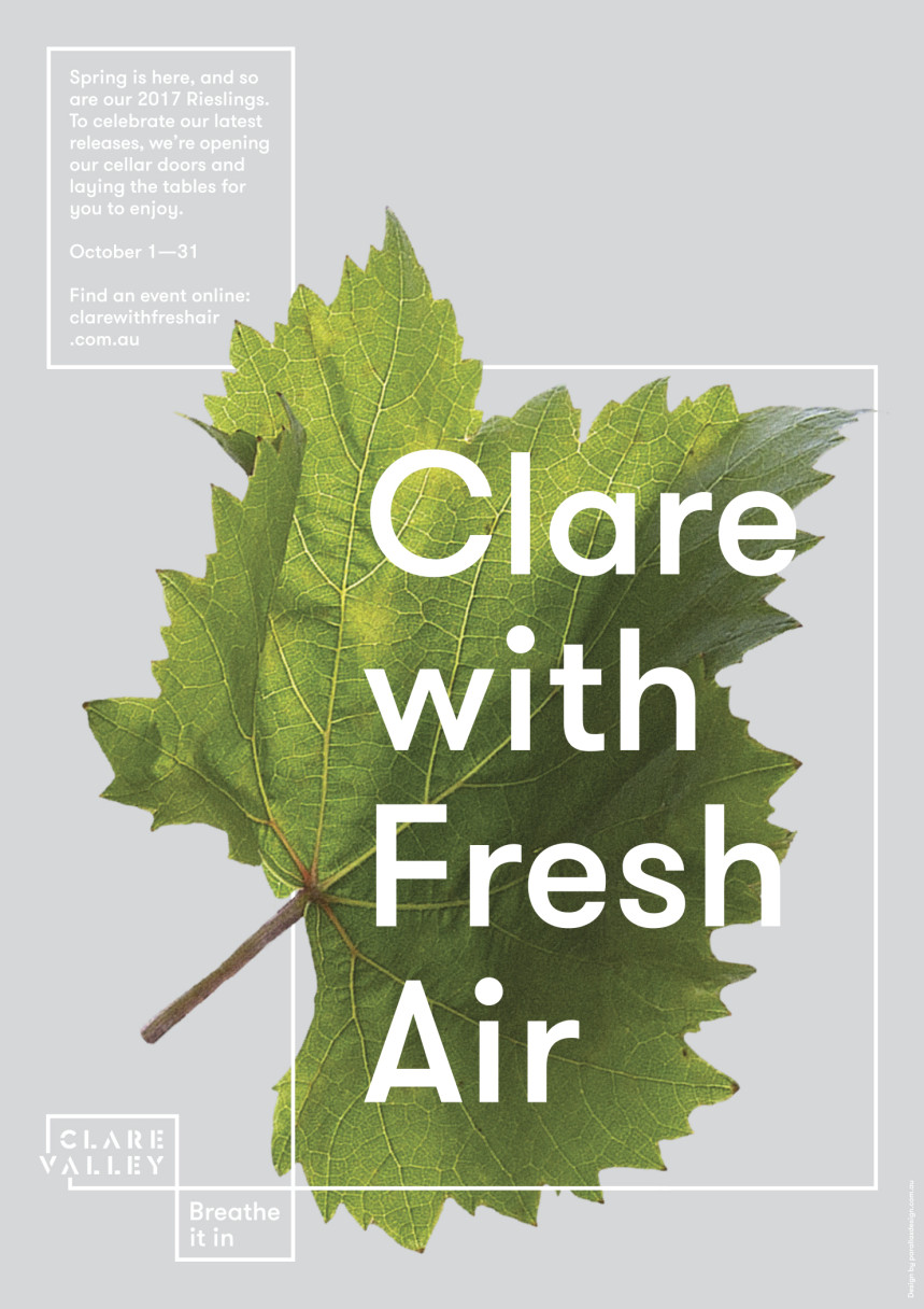
Flexibility has been purposely built into the identity programme. The graphical system established with the Logo and Positioning Statement of “Breathe it in” marks also support messaging and communications allowing for destinations, towns, regions, attractions, headlines and instructions to be embedded in the Brand Identity.
The system also allows for variation in form, size and emphasis of message.
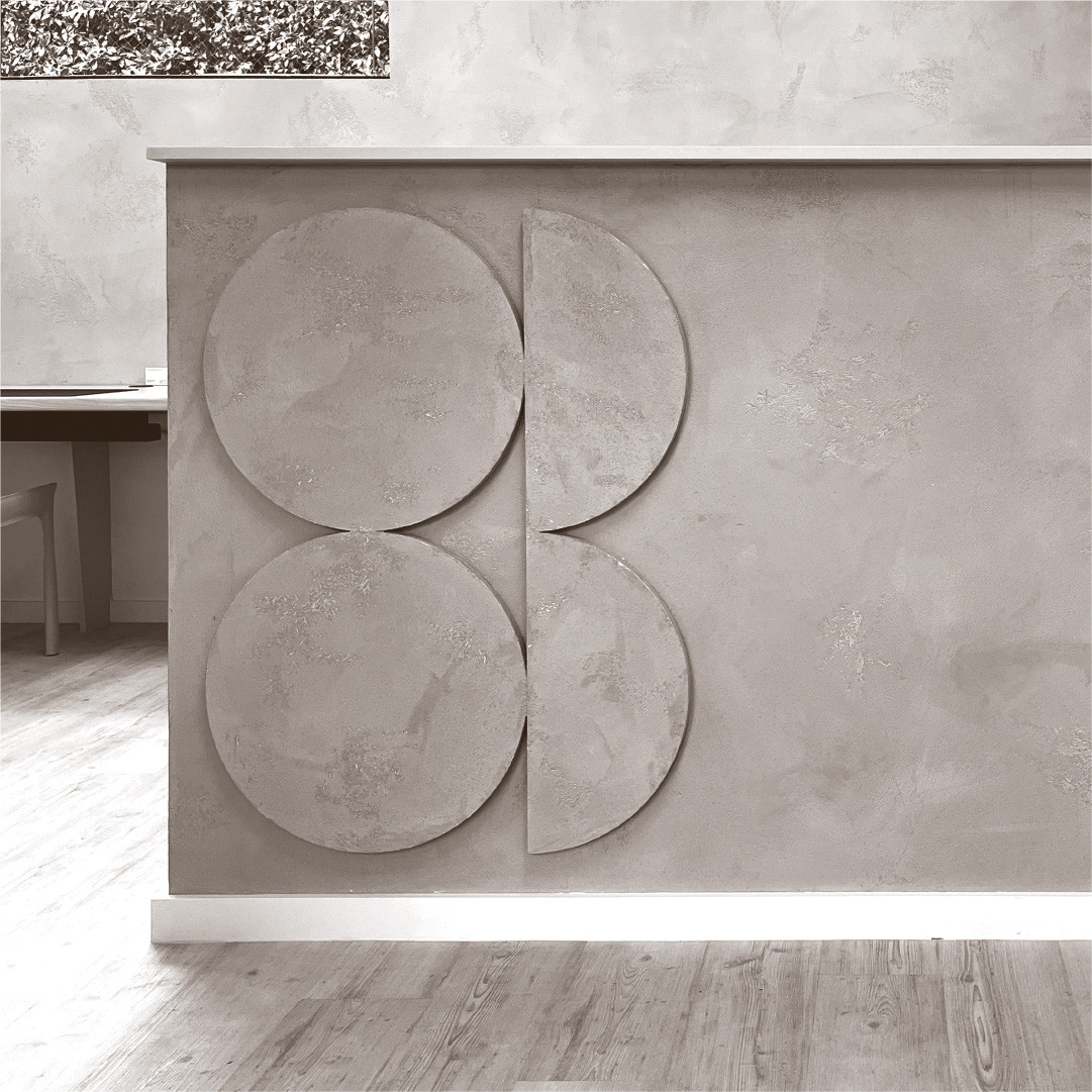
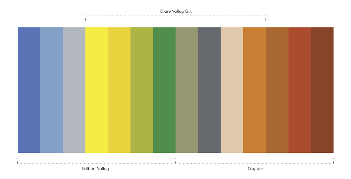
The colour palette developed continues this ideal of flexibility, allowing sub-regions, councils and towns within the Clare Valley region to personalise their brand outcomes and communications, whilst remaining consistent to the master brand. A material palette was also developed for use on branded built forms, such as signage, entry markers and public sculpture. Like the colour palette, the materials have been selected for the relevance to, and prevalence in the region.
The success of the new Brand and Identity system is evidenced in how it has been embraced by local government, tourism operators, business and industry, and the community.